Shared navigation
Both sites use an identical semi-transparent light-cyan navigation bar. It is the most direct visual link between the two brands. The content differs — one uses the Artfuly round logo, the other uses a text wordmark — but the bar itself is the same.
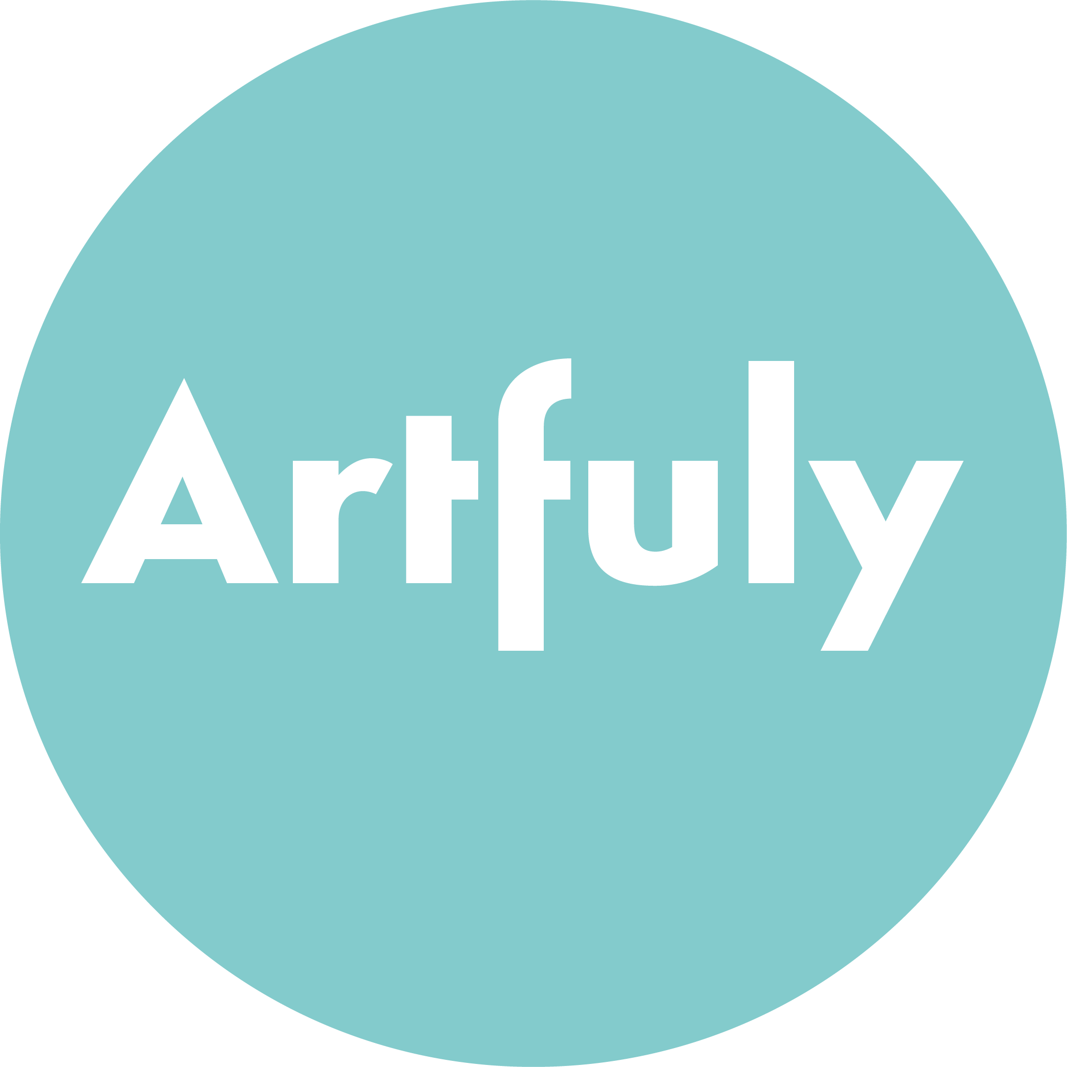
Artfuly logo
The Artfuly logo is a circle in retro teal (#84cacc) with the wordmark "Artfuly" in white Simplo Heavy. The favicon is a teal square with a white "A" styled as an artist's easel. There is no separate standalone mark — the circle is the mark. Mockups at 'DON'TS' below approximate the letterform using Montserrat (Simplo Heavy is not a web font).
 ½ × logo diameter
½ × dia.
½ × dia.
½ × logo diameter
½ × logo diameter
½ × dia.
½ × dia.
Artfuly colour palette
The palette is anchored by two teals and one coral. Dark teal dominates structural elements. Coral is reserved for primary CTA buttons only — never for decorative use. Charcoal is text only and must never be used as a background.
Artfuly typography
Montserrat handles all structural type. Merriweather is used exclusively for article body paragraphs to aid long-form reading. The two fonts are never mixed within a single text block.
Generating surface pattern designs with AI tools has become one of the fastest ways to build a Spoonflower portfolio. The key is knowing how to combine Midjourney prompts with Topaz Gigapixel for the final upscale.
Italic Merriweather for pull-quotes and callout text within articles.
.w-richtext p). Strong readability at length.Artfuly buttons
Three button types cover all actions on artfuly.com. Coral is always the primary CTA — it must stand out from the teal environment. Ghost and pill variants handle secondary and nav-level actions.
| Property | Standard | Large (article CTA) |
|---|---|---|
| Background | #ee7c7b | #ee7c7b |
| Hover bg | #e5605e | #e5605e |
| Text | #ffffff · Montserrat 700 | #ffffff · Montserrat 700 |
| Font size | 13px | 16px |
| Padding | 12px 22px | 16px 40px |
| Border radius | 30px (pill) | 30px (pill) |
| Property | Value |
|---|---|
| Background | transparent |
| Border | 2px solid #048ba2 |
| Hover | bg #048ba2 · text white |
| Text | #048ba2 · Montserrat 700 · 13px |
| Padding | 10px 20px |
| Border radius | 30px |
Artfuly components
Key repeating patterns used across artfuly.com: the article card, article body layout, and email sign-up form. Each has a fixed structure that should not be varied.
| Element | Style |
|---|---|
| Image | 16:9 aspect ratio · border-radius 4px · scale(1.03) on hover |
| Title | Montserrat 700 · 15px · #233030 · turns #84cacc on hover |
| Excerpt | Montserrat 400 · 14px · #555 · line-height 1.6 |
| Card wrapper | display:block · text-decoration:none · no card border |
Section heading (H2)
This is article body text set in Merriweather Regular at 16px with 1.8 line-height. Long-form reading comfort is the priority — the extra leading helps eyes track back across a full-width paragraph.
Inline prose link — use the .prose-link class on all inline body text links (Montserrat and Merriweather pages). Colour: #048BA2, bold, underlined, inherits parent font-size. Never use the webflow.css default link style (18px/500/no-underline) for inline body links. Bold uses Merriweather 700. Italics use Merriweather Italic.
Sub-heading (H3)
H2 and H3 inside articles revert to Montserrat 700 to maintain a clear typographic hierarchy against the Merriweather body.
Name treatment
rachaelpage.com has no separate logo mark. The name "Rachael Page" set in Montserrat 700 is the brand identity. It appears in the nav, on headings, and in the footer — always in black (#000000) on light backgrounds.
rachaelpage.com colour
The portfolio palette is deliberately restrained: black and white carry the structure, teal appears only as an accent. This keeps the work (case studies, images) as the visual focus rather than the surrounding chrome.
rachaelpage.com typography
Montserrat is used throughout at weights from 300 to 800. Barlow Condensed appears in one specific context — testimonial blockquotes — for its distinctive condensed italic character.
.r-block-quote only.rachaelpage.com buttons
Two primary button styles: solid black pill for primary actions, outlined pill for secondary. Both use 100px border-radius giving a full pill shape. There are no coral or teal-fill buttons on rachaelpage.com.
| Property | Value |
|---|---|
| Background | #000000 |
| Text | #ffffff · Montserrat 600 · 14px |
| Hover | opacity 0.8 |
| Padding | 13px 28px |
| Border radius | 100px (full pill) |
| Property | Value |
|---|---|
| Background | #ffffff |
| Border | 2px solid #000000 |
| Text | #000000 · Montserrat 600 · 14px |
| Hover | opacity 0.7 |
| Border radius | 100px (full pill) |
rachaelpage.com components
The portfolio's key repeating components: skill pills, work cards, category filter pills, and the impact callout block used in case studies.
| Property | Value |
|---|---|
| Background | #ceeaeb (light cyan) |
| Border | 1px solid #fff · outline: 1px solid #fff |
| Text | #233030 · Montserrat 500 · 12–13px |
| Border radius | 30px (pill) |
| Padding | 0.3rem 0.85rem |
| State | Background | Text |
|---|---|---|
| Default | rgba(255,255,255,0.1) | rgba(255,255,255,0.8) · Montserrat 500 |
| Active | #84cacc | #fff · Montserrat 600 |
| Hover | #84cacc | #fff |
| Element | Style |
|---|---|
| Card wrapper | bg #fff · border-radius 8px · hover opacity 0.9 |
| Image | 220px height · object-fit cover |
| Title | Montserrat 700 · 14–16px · #000 |
| Excerpt | Montserrat 400 · 13px · #888 · line-height 1.5 |
| Arrow | #84cacc · 14–16px |
The new design system reduced designer onboarding time from 3 days to under 4 hours, and eliminated 94% of visual inconsistencies across the product.
| Property | Value |
|---|---|
| Background | #f7f7f7 |
| Left border | 4px solid #84cacc |
| Border radius | 0 8px 8px 0 |
| Label | Montserrat 700 · 9.5px · uppercase · letter-spacing · #84cacc |
| Body text | Montserrat 400 · 14px · #000 · line-height 1.6 |
| Max width | 72ch |